Have you ever wondered what goes into running a creative business? This series is all about building and cultivating your own creative business from finding inspiration to e-commerce platforms to the nuts and bolts of operating a website.
In March, a reader wrote to me asking for advice on how to photograph her student’s artwork for her blog. In today’s digital age it’s not just about how to take a picture anymore. It’s all about branding yourself and your blog. And if that’s scares you or sounds like too much work, rest easy. It’s the most fun part about running a blog. Let’s dive in….
Which camera is best?
It has never been easier to create amazing images for your blog posts. You don’t have to have an expensive camera. Really. Your smart phone is capable of creating great quality photographs. You can edit your images directly on your phone and even publish to your blog. When I first began blogging, I used an inexpensive Sony camera. Phone cameras weren’t the best option so you really needed to take a camera into your art room. As I developed more photography skills I invested in a DSLR camera. I bought a Canon Rebel T2i and still use it for all of my photographs. The camera body is basic so I upgraded my lens. The lens I use almost exclusively is a 35mm prime lens. The prime means that there is no zoom. You are the zoom so you have to move your body towards your subject to fill the frame or pull back to include more in your image. Whichever camera you use, make sure you do the following:
- Carry in with you
- Clean the lens often (especially your camera phone)
- Edit all of your photos
Tips for taking photographs of student’s artwork
In my Teaching Art 101 e-course, I demonstrated how to take a picture for the purpose of a student gallery. The most important thing to remember is that the artwork needs to be flat and perpendicular to YOU. This may mean that you will have to stand above a piece of art when taking a picture or place the picture on a straight easel so you don’t have an awkward angle. I can’t stress how important this is. Unless you stand directly above the artwork, you will have a distortion and it will be almost impossible to crop your image.
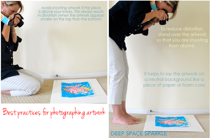
You don’t have to take ALL of your blog’s images this way. Only use this method for the pictures of artwork that are meant for a grid-like student gallery or individual images. Of course, you can avoid this by choosing to showcase your student artwork differently.
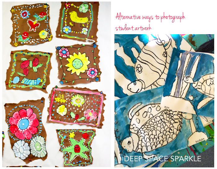
I like creating student galleries but there are other options. If you like to display your student’s art on a bulletin board or wall, just stand in front of the display and snap away. You can also stack or scatter artwork along a table and take a picture from an angle. I love this look as it is natural and feels like you are walking through an art room and peaking at what students are creating.
Great photo-editing options for your blog images
How important is editing your images? Pretty darn important. Considering that there are thousands of art blogs out there, you need to understand that people will click on your site and stay there for about 5 seconds before deciding to read your post or clicking off your site. A great image will lure them to you through social media or those nifty blog thumbnails on Blogger. Make it a good one. Do not underestimate the importance of great images. The hard truth is if a blogger doesn’t take the time to edit or arrange photographs, I’ll move on. What about you? If you are uploading unedited images to your blog “just to get it out there”, I urge you to reconsider your efforts. Does this sound like you?
- I want my photographs to look real and not fancy
- I’m not blogging to make money so what does it matter
- I don’t want to leave anything out
- I don’t have time to edit all of my photographs
First off, if you are short on time, I hear you. It takes ALOT of time and effort to post images on blogs but I strongly feel that one edited photo is far more impactful than 20 unedited ones. If all you do is crop the edges, brighten the image and add your blog signature, that is enough. If you add a few graphics to illustrate what your post is about, all the better. If you are serious about blogging and interested in monetizing your blog, you really want your visitors to stick around. Here’s my checklist for all of my blog posts:
- Feature Image Photo: this is the photo that goes at the very top of my post. It is usually the photo that I select for my feature image (the little thumbnail beside the post) and also the one that gets used for sharing on Facebook. It is sized like a rectangle because that’s what works for Facebook. You may not care about Facebook so just size this photo the width of your post body and not too long. Mine is generally 680 x 600px. I make sure the TITLE of my blog post is detailed plus add my signature.
- Tutorial Images: I create 2-3 art tutorial photos that are anywhere from 680px x 600px to 680px x 1200px. I sometimes add numbers or text to highlight the steps in the tutorial. I always add my signature.
- Student Gallery: I create a student gallery by adding edited individual images of student art to a blank image. I almost always add a title and my signature.
- Pinterest Image: Pinterest loves long images but I feel that sometimes adding that long image to my blog post is overwhelming to my reader. So instead, I create a separate image just for Pinterest. I may or may not add it to my blog post. It is usually long 680px x 1300px. When I do add it to my blog post, it may be located at the bottom of the post or sometimes used instead of the featured image. I’m still playing around with this.
Take a look at my sea turtle post. I have three images: feature image post optimized for Facebook, tutorial post optimized for Pinterest and a student gallery. Naming your images is VERY IMPORTANT. Read this post for a review of how and why to name your photos.
Great editing applications
I love Photoshop and use it to edit all my photographs and to create my images for my PDF lessons and e-courses. But, it can be expensive and difficult to learn. Here are some really great alternatives (and free) to PS:
CANVA: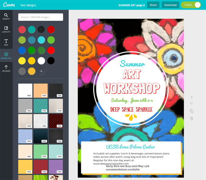
If you haven’t tried Canva before, you simply must. It’s amazing. It’s a super easy way to create standard graphics for social media blog posts and more. Now that summer is almost upon us, take a day and play around with this free tool. You’ll be creating cool graphics in no time.
PICMONKEY
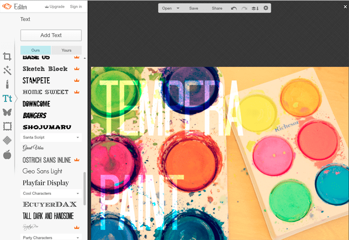
This photo-editing site has been around for a while so no doubt you have heard about it. I used this site almost exclusively to create the images for my first e-course. You can edit your photo, add graphics and text…everything. The trick is to not to add everything they offer in one photo. So hard! These two sites show you basic templates for designing your images so you don’t have to start from scratch like you would if using Photoshop or Elements. Canva is especially good for this as you can pick the “look” you are after then substitute your images and text.
Developing your own blog style through your images
PicMonkey and Canva allow you to piggy-back on the most popular design tools and trends by allowing you to drop in your photos to existing templates. This can get very exciting so make sure to remember your blog branding. What is blog branding? A fun exercise to do when you are home on a rainy Saturday is to play around with creating a Blog Branding Sheet.
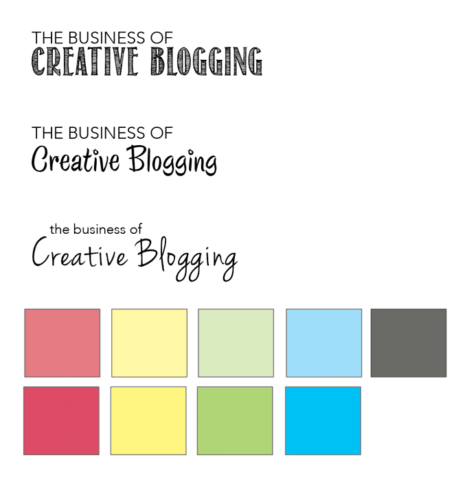
A Branding Sheet helps you decide on the colors, fonts and styles you want to use for your blog. I have a branding sheet for Deep Space Sparkle and refer to it when I need to make color or point choices. It can help you decide how a font looks with certain text.
Here are some basic guidelines for designing your Branding Sheet:
- Pick 2-3 fonts that you will use for your graphics and any products you sell. I like to include the font for the main title, a font for the text and a decorative font. Play around with what appeals to you.
- Pick 4-6 colors for your color chart. Add the RGB codes and hex#’s so that when you design a graphic on Canva or PicMonkey you can open up your branding sheet and copy and paste the codes into the color section. Makes it a lot easier than trying to remember what shade of yellow you like. It also keeps things really consistent.
- Create your Branding Sheet in Photoshop or even PicMonkey. Treat it like it were a photograph and make it large enough to read. Save it as a PDF file and place on your desktop. Whenever your are designing an image, open the Branding PDF and you’ll have all your information ready to copy.
More blog post tips:
I really like this comprehensive post on byregina.com
If you managed to read this post all the way to the end, you deserve a little gift:
Have you ever struggled with editing your photos? Do you have a program or tool that makes editing easy? Do you have a branding sheet? I’d love to hear what you use or where you struggle.
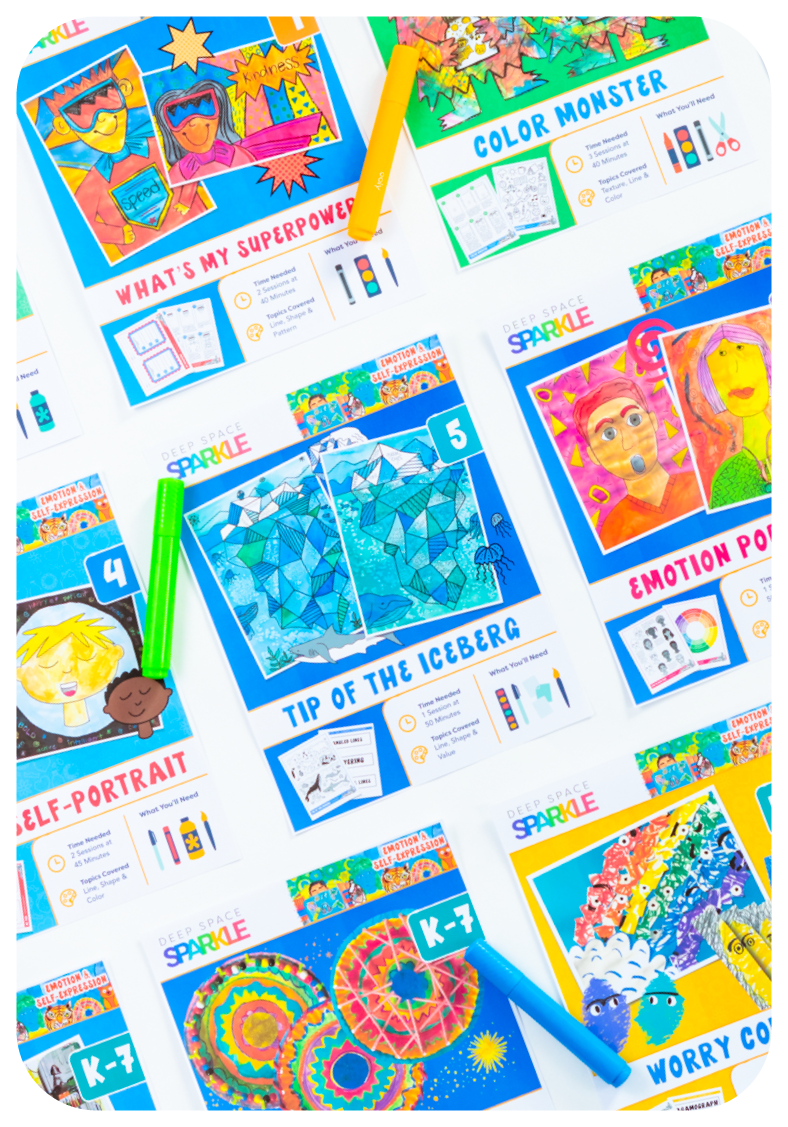
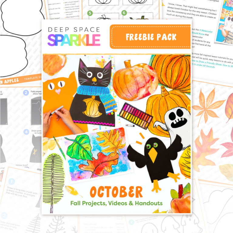
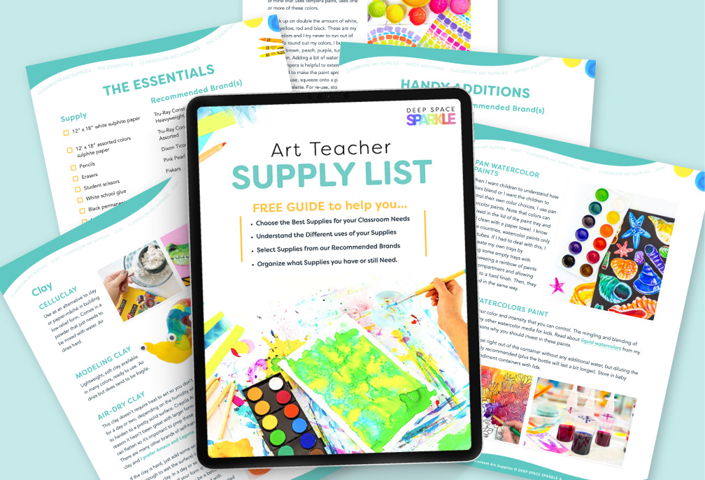
Download your free PDF BRANDING WORKSHEET & POST CHECKLIST GUIDE




Great information as always. Thanks for sharing your expertise.
Marsha
Thanks, girl! This was super helpful. I pay for photoshop at home but since i don’t have admin rights on our computers at school (and it likes to auto-update), I can’t use it at school. Grrrr. Drives me nuts! So I’m excited to try some of these websites you mentioned.
How about blog editing? Do you use wordpress or another platform? Do you self-host? Did you come up with your own theme or purchase from someone? I’m at that stage where I can’t decide if I want to switch from wordpress.com to .org and start going a little further with my blog. I would love to hear your input. Thanks!
Patty, great post! I have ALWAYS edited all my photos, because I’m pretty picky. I am not Photoshop savvy, so I’ve used the basic ‘Photos’ editor on my PC. It’s actually really good for straightening, adjusting color and light balance, and a few other basic fixes. But I had never been to PicMonkey until now, and I like how easy it is to add text, in particular! Thank you! I’ll be checking out Canva next!
Thank you for all of this valuable information in one easy to comprehend post!!! Seriously, some of this tech stuff is just SO MUCH to learn…sigh. I am working on getting a blog (DIY, Thrifty Decor, etc)up and running, but I keep getting overwhelmed by the amount of WORK, and learning that is involved. I do NOT want to hit publish on a sub-par product, but I also just want to get started already… This is all really good info, and I thought it was just going to be about images, but you really packed a LOT into one post! so glad I clicked on this and again, THANKS for sharing!
Thanks Patty! I appreciate the consolidated info I can always find at DSS. Wish me luck as I get rolling on blogging and advertising summer camps today. I offer drawing and digital art classes using iPads to small groups in my basement studio in Lake Ridge Virginia.
I liked this post a lot. What I’m wondering, as I struggle to build a website on WordPress for my private art classes, is should I make a blog or a traditional website with a link to a blog? What attracts people? Do people read blog passages or are they just distracting? Some of my friends have said, no one’s gonna want to read so much. Just get to the nitty gritty.